
Published under: Release Notes
1 min read
简要了解 ESLint 最近的品牌更新和网站改版。
嗨!我叫海登。我是一名设计师和开发者,直到最近,我经营着一家名为Jellypepper的小型机构。
🌐 Hi! My name’s Hayden. I’m a designer and developer and, until recently, I ran a little agency called Jellypepper.
我们有幸与 ESLint 团队合作他们的新品牌和网站。我是 ESLint 的忠实粉丝,每天都在使用它,甚至特意编写了自己的 600 行 ESLint 配置,用于我所有的 React、Next.js 和 Expo 项目。
🌐 We were fortunate enough to work with the ESLint team on their new brand and website. I’m a huge fan of ESLint and use it every day, even going to the effort of writing my own 600-line ESLint config to use across all my React, Next.js and Expo projects.
Nicholas 最初在 Twitter 上联系了我们,以启动 ESLint 团队九年来承担的最大项目。他希望为 ESLint 团队及其社区创建一个更强的品牌形象,并使网站功能更强大、导航更便捷,对从新用户到资深用户的每个人都更有用。
嗨,Hayden,我想感谢你对 ESLint 的捐赠。碰巧的是,项目正在考虑进行一些品牌重塑(保留标志,更改其他所有内容)和网站重新设计,所以我想知道你是否有兴趣。看起来这可能是一个不错的契合机会。
这对我来说有点像梦想项目 😅 所以,不用说,我们完全参与了。
🌐 This was a bit of a dream project for me 😅 So, needless to say, we were totally in.
🌐 The Brand
ESLint 品牌是一个有趣的品牌——尽管官方视觉设计不多,但团队已经设法创建了一个独特且被开发者社区广泛认可的品牌。
🌐 The ESLint Brand is an interesting one - without too much official visual design, the team has managed to create a brand that is unique and widely recognized by the developer community.
🌐 The Logo
标志图形是 ESLint 品牌身份的核心,也是最易识别的部分之一。它与他们的生态系统紧密相连——你可以在各处看到它,从 IDE 市场到整个网络的企业赞助页面。它承载着开发者社区的期望,这些开发者对自己编写的代码充满热情。
🌐 The logomark is at the core of ESLint’s brand identity and one of the most identifiable pieces. It’s a connection to their ecosystem - you can find it everywhere, from IDE marketplaces to corporate sponsorship pages across the web. It carries with it the expectation of a community of developers who are passionate about the code they write.
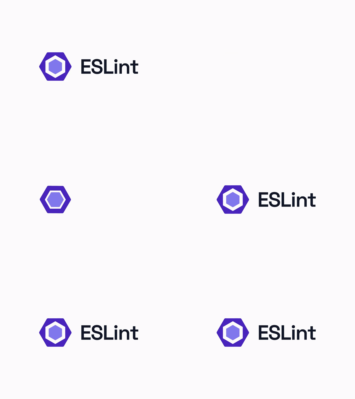
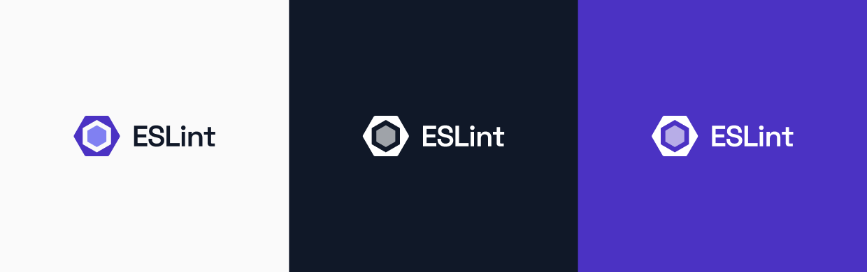
虽然我们保留了图标(鉴于其在网站、IDE、平台和项目中的广泛使用),但我们希望它能更精致、现代且灵活一些。通过将其与我们新的主要字体 Space Grotesk(下面会详细介绍)结合起来,我们创造了一个新的 ESLint 标志。由于其简洁性,它可以在各种颜色和空间中使用。
🌐 While we kept the icon (given its widespread usage in websites, IDEs, platforms and projects), we wanted to make it that little bit more refined, modern and flexible. By bringing it together our new primary typeface, Space Grotesk (more on this below), we created a new ESLint logomark. Due to its simplicity, it works in a variety of colours and spaces.
🌐 The Typeface
作为一家以内容为驱动的组织,排版是新 ESLint 品牌的核心。网站、文档和博客都需要排版既可读又令人愉悦。该品牌利用了一套有目的的排版风格,旨在让内容对所有人尽可能易于访问。
🌐 As a content-driven organization, typography is at the heart of the new ESLint brand. The website, docs, and blog all require typography to be readable and enjoyable. The brand leverages a purposeful set of typographic styles designed to make the content as accessible as possible for everyone.
从技术角度来看,我们希望字体广泛可获取且位置方便,这样可以在任何地方访问它(特别是在其他 Google 产品如文档和幻灯片中),并且它符合免费和开源的主题。
🌐 From a technical point of view, we wanted fonts that were widely accessible and conveniently located, so could access it everywhere (particularly on other Google products such as Docs and Slides) and it fits with the free and open-source theme.
我们决定选择 Space Grotesk——一款极佳且富有特色的字体,它在具有独特风格的同时,又融入了反映开发者特质的技术几何元素。它通过与标志设计理念相呼应的独特细节塑造个性,并通过展示更多技术细节为品牌带来活力与能量。
🌐 We decided to go with Space Grotesk — a fantastic, characteristic font that balances that flair with the technical geometric elements reflecting a more developer-centric side. It creates character with its idiosyncratic details that share principles with the logomark and brings life and energy to the brand by showcasing its more technical details.
Space Grotesk 与其源始姐妹字体 Space Mono 密切配合。它是为编辑用途开发的,适用于标题和展示排版;字形将几何基础与怪诞细节融合,这些特质常见于 1960 年代的标题字体,其中许多后来被科幻电影、电视和文学所采用。
🌐 Space Grotesk works hand-in-hand with its origin sister font, Space Mono. It was developed for editorial use in headline and display typography; the letterforms infuse a geometric foundation and grotesque details with qualities often found in headline typefaces of the 1960s, many of which have since been co-opted by science fiction films, television, and literature.

🌐 The Colors
ESLint 的色彩调色板以与文案和标志同样有力的方式传达品牌信息。它不仅影响品牌设计的外观,还可以激发情感并反映 ESLint 品牌的个性。颜色是设计给人的第一印象,因此在设计的整体外观和感觉中起着重要作用。
🌐 ESLint’s color palette speaks to the brand in ways that are every bit as powerful as the copy and logo. It not only affects how the brand design looks, but can go as far as to elicit emotion and reflect the personality of the ESLint brand. Colors are the first impression a design makes, and as such, play an important role in a design’s look and feel.
虽然颜色可能是主观的,但显然,好的颜色可以吸引并转化用户。另一方面,糟糕的颜色会让用户远离,甚至使设计变得无法访问和不可用。
🌐 While color can be subjective, it’s clear that good colors can attract and convert users. Bad colors, on the other hand, can turn away users and even make designs inaccessible and unusable.
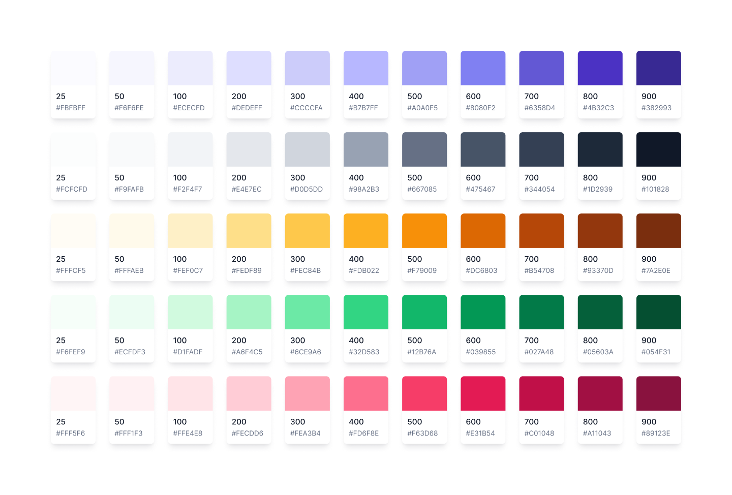
由于 ESLint 的功能性特点,我们选择保持简单,使用一个主要的、中性的以及少量的辅助色板。新的主色板源自原始标志——我们使用两个现有的颜色来创建独特的主色调范围。
🌐 Due to the functional nature of ESLint, we chose to keep it simple with a primary, neutral and small set of secondary palettes. The new primary color palette is derived from the original logo — we use the two existing colors to create a unique primary tonal range.
🌐 The Website
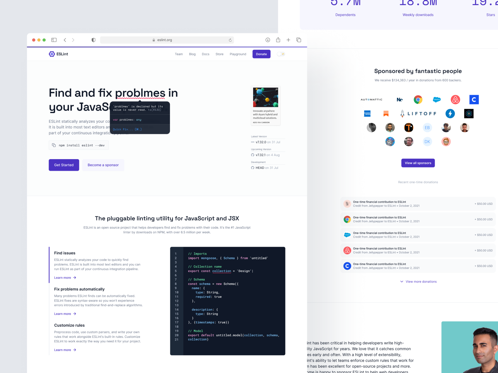
接下来是对ESLint网站的重新设计。除了最大化网站的视觉吸引力之外,我们还希望在每个页面上实现一些目标。例如,在主页上:
🌐 Next up was the redesign of the ESLint website. Besides maximising the visual appeal of the site, we had a few goals we wanted to achieve for each page. For example, on the homepage:
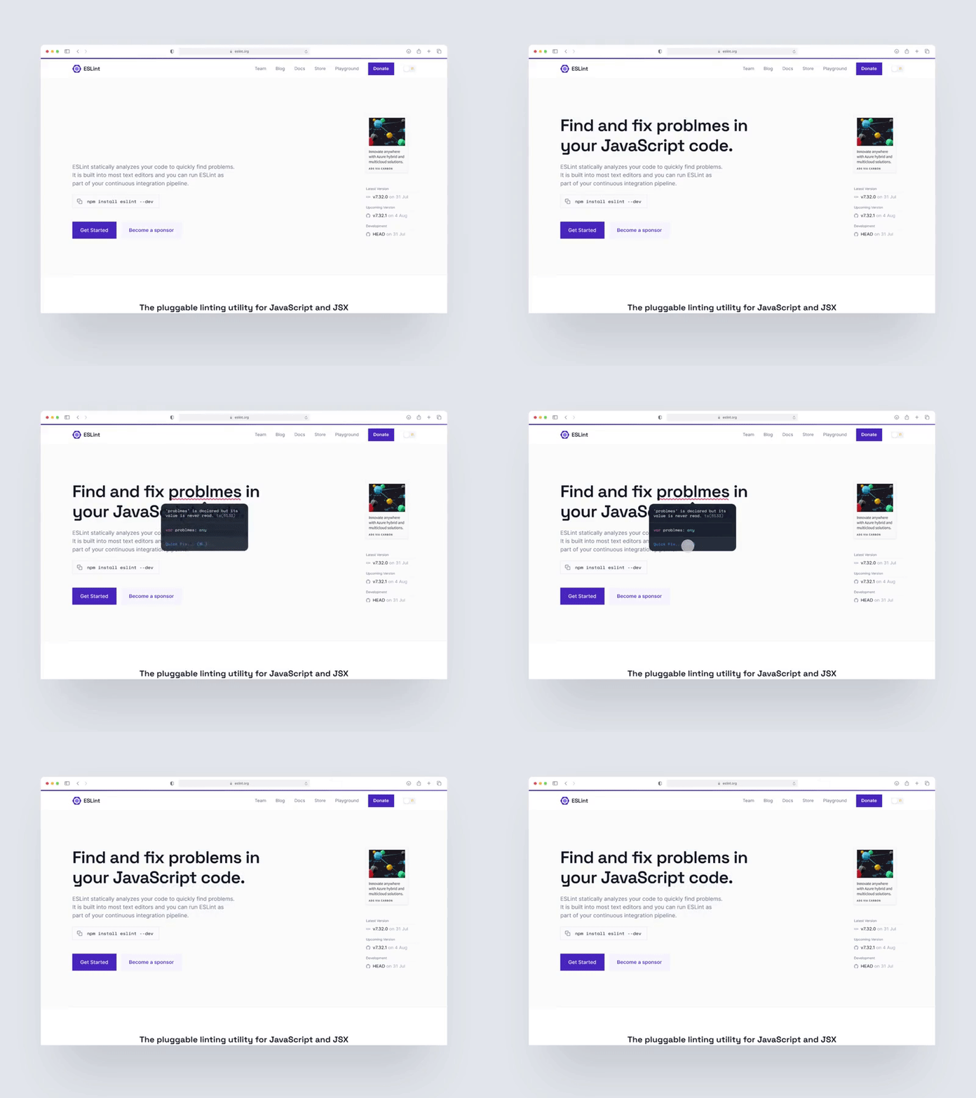
我也希望在 ESLint 首页的主视觉中加入一些动画和生气,同时让我们的观众感受到使用 ESLint 的体验。
🌐 I also wanted to introduce some animation and life into the ESLint homepage hero while giving our audience a sense of what it’s like to work with ESLint.
VS Code 中的红色下划线与 ESLint 同义,因为这是 VS Code 实现 ESLint 操作项的方式。使用这些视觉指示器,我创建了一个小而有趣的交互,为我们的访问者提供简化的体验。
🌐 The red underline in VS Code is synonymous with ESLint, as it is the way VS Code implements ESLint action items. Using these visual indicators, I created a small but fun interaction that gives our visitors a simplified experience.
我对这个想法的最终效果特别满意!💡
🌐 I was particularly happy with how this idea turned out! 💡
通过融入更广泛品牌的元素,包括IDE集成、代码片段和支持者标志,我们让品牌焕发生机。此外,没有Addy Osmani的推荐语,任何开发者网站都不算完整。
🌐 By incorporating elements of the wider brand including IDE integration, code snippets and supporter logos, we brought the brand to life. Plus, no dev site would be complete without a testimonial from Addy Osmani.
🌐 The Docs
接下来是大佬级人物,重新设计 ESLint 文档。文档是 ESLint 生态系统的核心部分,也是用户查找项目和代码库信息的地方。
🌐 Next up was the mack daddy, redesigning the ESLint documentation. The docs are a central part of ESLint’s ecosystem and are the place where users find information about the project as well as the codebase.
我们希望对其进行一些改造,在所有页面上创建一致的信息架构(IA),并使页面更易于浏览和导航。我们还添加了一个版本下拉菜单,以查看文档的以前版本。
🌐 We wanted to give it a bit of a revamp, creating a consistent information architecture (IA) across all pages, as well as making the pages easier to scan and navigate. We also added a version dropdown to view previous versions of the docs.
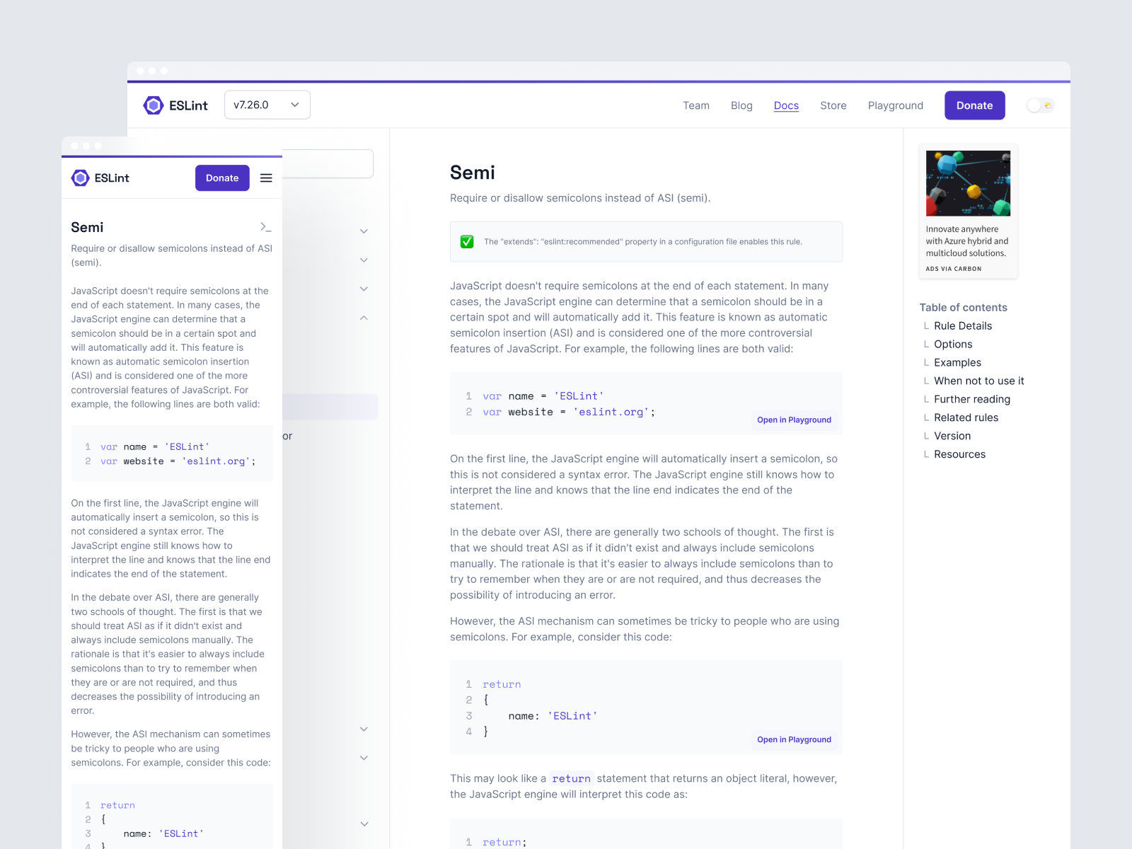
我还把小型 Carbon Ads 组件发布为一个 Figma 社区文件!
🌐 I also published the little Carbon Ads component as a Figma Community file!
🌐 The Playground
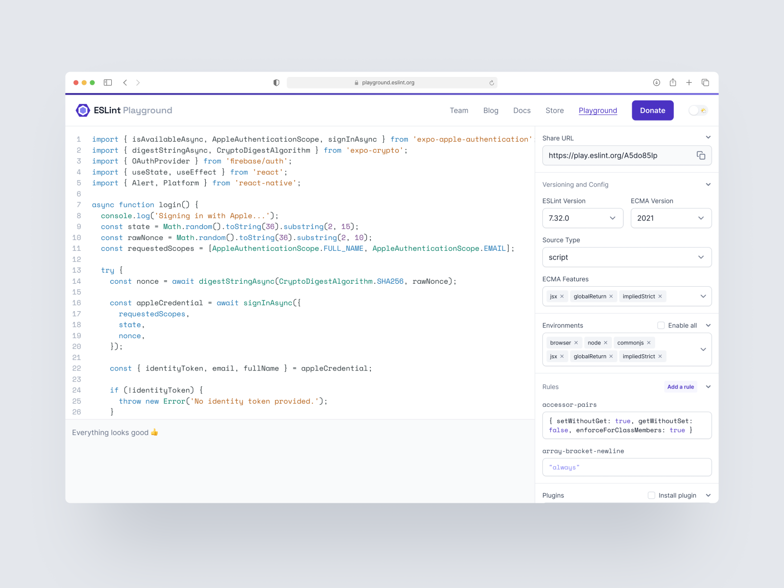
项目的最后一部分是一个名为 Playground 的新微型网站!它是一个非常棒的小工具,允许你使用易于使用的设置创建 ESLint 配置文件,并针对它测试你的代码。然后,一旦你满意了,你可以下载你的配置文件在本地使用。这也是一种让新用户直接在浏览器中尝试 ESLint 的绝佳方式。
🌐 The last part of the project was a new microsite called Playground! It’s a fantastic little tool that allows you to create an ESLint configuration file with easy-to-use settings and test your code against it. Then, once you’re happy with it, you can download your config file to use locally. Its also a fantastic way of allowing new users to try ESLint directly in the browser.
我们在设计 Playground 时考虑了几个关键要求——具体来说,我们希望它易于使用,并且能够轻松创建和分享可重现的 ESLint 错误。用户还应该能够在不同版本的 ESLint 之间切换,查看给定问题的潜在修复,并安装插件。最终,团队无法实现所有这些功能,但我们仍然为它们进行了设计。
🌐 We started designing Playground with a few key requirements in mind — specifically we wanted to make it easy to use, and to make it easy to create and share reproducible bugs with ESLint. Users should also be able to switch between different versions of ESLint, see potential fixes to given problems and install plugins. Ultimately the team couldn’t implement all of these features, but we designed for them all the same.
这里有一些棘手的设计挑战需要克服——尤其是在信息密度方面。在用户界面中展示所有规则会使视觉上难以解析,因此我们需要一种在不必滚动到页面底部的情况下将规则添加到用户界面的方法,并且能够轻松自定义每条规则的值。
🌐 There were a few tricky design challenges to overcome here — particularly around the density of information. Exposing all rules in the UI would make things visually difficult to parse, so we needed a way of adding rules to the UI without having to scroll down to the bottom of the page, then customising the value of each rule easily.
🌐 What’s next?
ESLint 团队目前正在推出上述所有内容(你现在就在新网站上!)
🌐 The ESLint team are currently rolling out everything above (you’re on the new website right now!).
我想感谢 ESLint 团队,特别是 Nicholas,给我提供了参与这个项目的机会。我也非常幸运能够与如此有才华且充满热情的人一起工作,比如 Sara 和 Gavin。
🌐 I want to thank the ESLint team, especially Nicholas, for the opportunity to work on this project. I was also very fortunate to work with such talented and passionate people, such as Sara and Gavin.
如果你对 ESLint 品牌有任何问题、评论或反馈,请通过 Twitter 与我联系,账号为 @haydenbleasel。
🌐 If you have any questions, comments, or feedback on the ESLint brand, please reach out to me on Twitter at @haydenbleasel.
祝大家代码检查愉快,伙计们!✌️
🌐 Happy linting, folks! ✌️
最新的 ESLint 新闻、案例研究、教程和资源。
